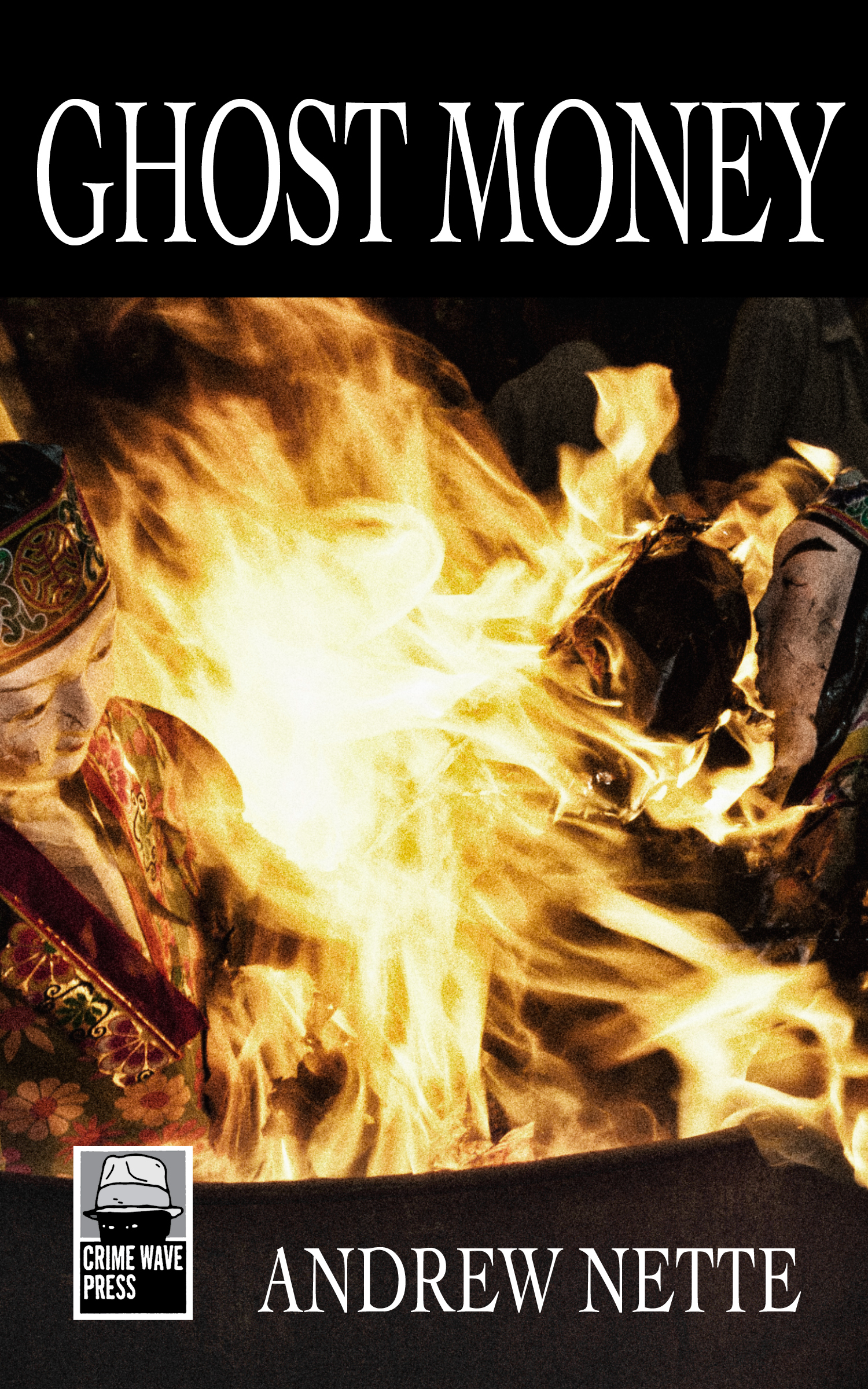
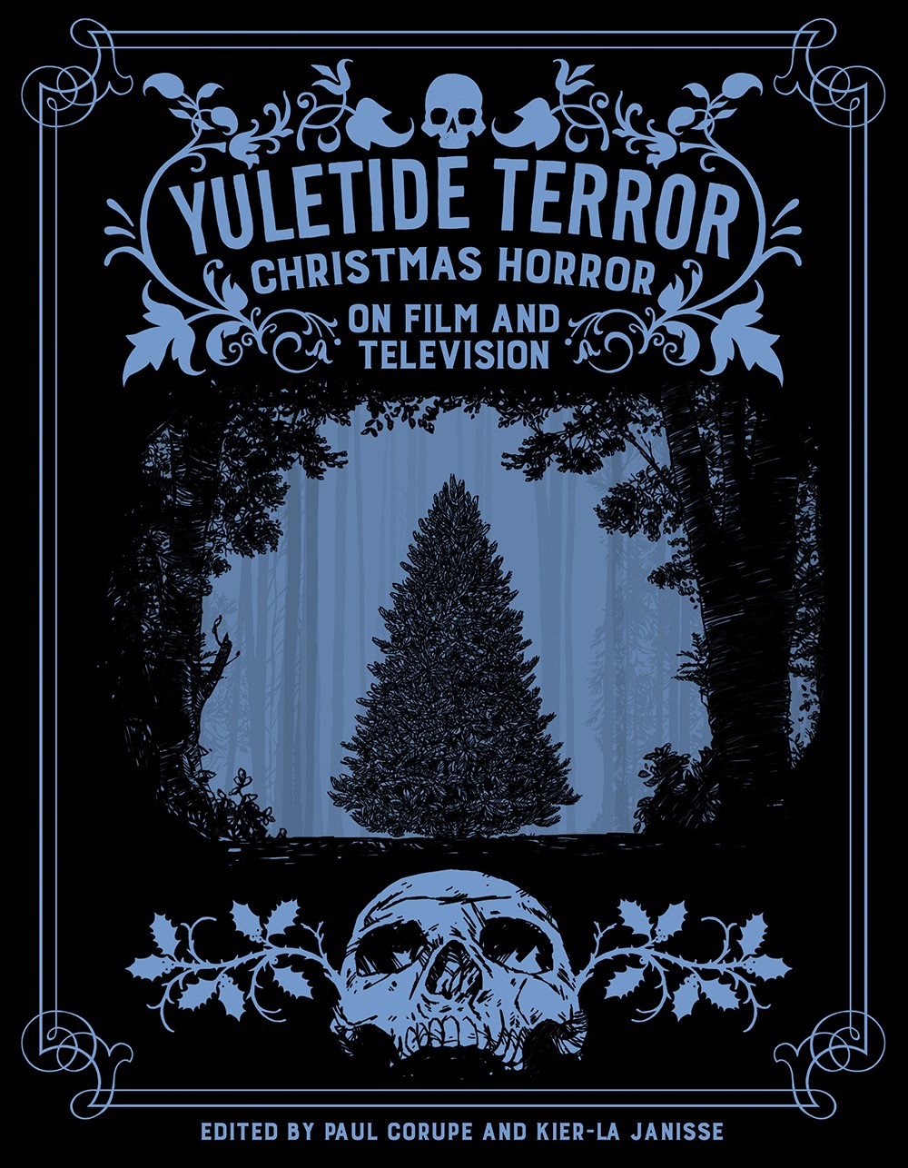
W H Chong is book cover designer based in Melbourne. From his first cover design job, a souvenir booklet to mark 1990 Collingwood AFL Grand Final victory, he has gone on to become Design Director for Text Publishing and has won multiple awards for his covers for young adult fiction, crime, classics and literature. Below is an interview I did with him on what is involved in a good cover design and his favourite cover designs from the science fiction reading of his youth. It originally appeared in the now defunct online magazine Spook, in August 2015.
How did you get into book design?
The correct answer is by accident. I started designing newspapers in the eighties and then I started doing magazines in the early nineties. When Text Media [now Text Publishing] started as an imprint of books run by Diana Gribble in the nineties, I was there, so I did the design. Because in the old days, people just did stuff. It was all very much a case of people putting something together that they were learning how to do as they went along. Design just needed to be done. Some of it included books. That was no big deal. There was no specialty. You weren’t learning to be a neurosurgeon; you were just doing things with scalpels, so to speak.
What makes a good cover design?
If you are going to design a book, let’s say you are going to take the trouble to read it. Then the question arises am I going to design this book for me, or am I thinking about the people we think are going to want to read this book? So, there is a certain amount of projection required, partly to do with whom the author thinks they are writing for, presuming they are writing for someone. Then there is the commercial aspect, the people the publisher thinks they can find to buy the book. But the pure answer to the question is: If I have read the book, will I design it how I like it or how I think people who will be interested in the book might like it?
Sometimes the question arises, am I the same kind of reader as the likely readers of this book? If I am, it’s easy. If I’m not, then you need to think about who these people are. Book cover designers are like defence counsels, you don’t care whether the client is guilty, you are just trying to pitch the best defence and, to do that, you have to know who your pitching that too. You have to work out the jury and judges. It is not my business whether people think the book is good or bad, just to do the best cover.
Do you always read the book before you design the cover?
I would always read as much of the fiction as I can. If it’s non-fiction I may or may not read it depending on time. Sometimes the manuscript is not ready. So it is messy.
Have you always had a life long love of book cover design, or is that something that has developed reasonably recently?
Well my golden age of reading science fiction was when I was fourteen so. I knew from that age what turned me and have very clear memories of what I read then and the covers I liked.
Do you have any idea how important is cover design to the success of a book?
Well, if you ask the [Text Publishing] marketing department they would say hugely, massively important. I would be very resistant to buy a book I didn’t like the look of and I know from people telling me stories that people do buy a book because they like the look of it, sometimes without knowing very much about it. I think covers do mean something, but it is not easy to put into words. I mean you would not want to eat a meal that did not look attractive to you.
Do you ever consult with authors about covers?
No. Never. I never talk to the author. It interferes with my job. They don’t ask me how to write a book.
I asked you to select some of your favourite covers to discuss today and everything you picked is science fiction, mainly from the sixties and seventies. What is it about the covers of this era you like and why do they resonate so much with you?
Reverse engineering the question, I must have picked up one [science fiction book], I can’t remember which, and found it tremendously exciting and compelling and I must have following on and found others. I can certainly remember making up stories when I was six or seven and they always had a kind of science fiction aspect. I think my attraction to these books was very strong associated with the notion that there was somewhere else to go. Those books resonated so strongly with me because they were about freedom and liberation from the here and now. Isn’t that what most people read fiction for, most of the time, escapism? Otherwise, they’d be watching realist fiction all the time and watching realist movies all the time, and, clearly, they are not the big money spinners. Science fiction is nothing if not at the very least about escapism. It can be other things, too, but it takes you away. Far, far away.

 Lets discuss some of the covers you have nominated as your favourite starting with these two books by Ursula Le Guin, The Dispossessed and The Left Hand of Darkness. They are obviously extremely famous books, what is it about these covers you like so much?
Looking at these now they are my idea of perfect science fiction covers. Obviously I didn’t know this when I first read them. The Dispossessed is a story of rivalry about two planets, one of which claims to be run on socialist grounds but is actually quite authoritarian, the other is capitalist and more overtly totalitarian. The image is a very simple, iconic, memorable image. There is this very neat thing, where the hero, who looks very heroic, is looking at a world. But you can break it down. The figure is very much the same as the man in the famous 1818 painting by Caspar David Friedrick, ‘Wanderer About A Sea of Fog’.
The colours are beautiful, too.
They look especially good side by side. There is a red themed book cover, The Dispossessed, and a blue book, The Left Hand of Darkness. The latter was about a planet where men and women share biological characteristics. The protagonist is an ambassador from another empire who comes to the planet and discovers the population can change sex according to who they partner with. This is incredible discovery for the ambassador, who I think is a man, and of course, the whole point of this is to discuss how the politics and power structure works because there are no men, as such, in charge. The cover for the The Left Hand of Darkness is cold but also warm at the same time. You are moving into a very cold place, but you know that there is something warm in the guise of the city in the background. That is why it is such an attractive cover. It evokes the same feeling you have when you are at the end of a long journey and you are driving through a dark night and you see that glowing window in the farmhouse.
I don’t know who did either cover. Publishers never used to include the artist’s details in books until recently. It happened and now it is a convention but before it never did.

The next cover you have selected is Nightfall One by Isaac Asimov.
This book is a collection of his short stories. There were two of these in the series, Nightfall One and Nightfall Two. Nightfall Two had a similar design but a yellow background. I can’t remember which stories are in Nightfall One but the cover is so striking. It is an amazing piece of work. It’s sort of a bar relief collage with painting and clay or plaster scene. It is actually three-dimensional with a painting stuck at the top of the man’s head, so you have a vaguely bucolic village night scene and then you have this wild totemic, primitive face. It is part savage, part childlike. It obviously draws from surrealism, but it’s got no place in the science fiction camp. It’s kind of art really. It seems to me to be more about imagination.
The cover seems to me to be both playful as well as having a sense of malevolence about it. It is in the vein of a lot of seventies science fiction, that escapism is both liberating but also dangerous. It asks the question, what will you find when you escape?
It is quite brilliant, but it is not a science fiction cover because it does not fulfil the genre requirements of a cover for science fiction. These include depictions of things clearly not in this world, usually, some aspect of space or sky, a clear identification of a certain time of day, quite often with exaggerated perspectives, quite often the human figure is quite small in the landscape. Also some idea of how we used to think the future would look. As a designer you have to understand these conventions, even though they are not written down anywhere. Basically, if you see a cover that’s meant to do erotic things to you, it had better do those erotic things to you. If you are looking at a crime fiction book, you need to have the cover say to you, this is going to be a crime fiction book, this is going to be interesting and dangerous and full of drama. Because, if it looked like an E.L. James book, you wouldn’t be buying it for crime fiction, would you?
 So you are big Philip K Dick fan?
I read Flow My Tears, The Policeman Said sometime in the nineties. I can’t remember what it was about. It was a druggy, trippy thing about identity, like most of Dick’s books. Dick had the best selection of book titles of anyone in writing but he was not well served by his covers because publishers didn’t understand how to deliver them in design format, they were just too way out. Flow My Tears, The Policeman Said is a perfect genre cover. In this case it is also quite literal, most often they aren’t. It literally has a policeman on the cover, even though he is not crying. The use of genre conventions is to immediately send you into this space.
The Man In the High Castle, a very famous Philip K Dick book. It is an alternative history where the Germans and the Japanese have won the Second World War and America is under Nazi and Japanese occupation. There is a whole sub genre of these books, but Dick did it earlier and I suspect better because it included drugs and identity, like all his books. This is an interesting cover because it is Dick being pitched as literature. I guess the publisher wanted to expand the audience or they wanted to raise his class level. I don’t entirely approve of it because science fiction is supposed to be about death to the literary world. That said it is a really affective, simple but clever design. I point it out to you because it is not something that is responding to the genre conventions. It is a science fiction genre book that is not trying to capture the science fiction genre audience.

What about this one, The Fountains of Paradise?
It has a very romantic feeling, which is not dissimilar to the Left Hand of Darkness cover, where you have a dark space and you have some alluring destination, which is inside the head. There is a sense of foreboding. You know that any human figure would be a very small thing. In others words, there is a big cosmic environment, which is what you want science fiction to do with you. And then you turn to the back cover and you think, ‘Oh My God’, because that is actually the whole point of the story. It is a fictional depiction of a geo stationary elevators, an idea first thought up in real life by a Russian scientist and Arthur C Clarke used it in this book. It is probably my favourite of Clarke’s books.
 I am familiar with this next one, Burning Chrome, a collection of short stories by William Gibson, first published in 1986. It is named after, ‘Burning Chrome’, one of the stories in it, about two computer hackers.
This book was published before he did Neuromancer, which came a couple of years later. Burning Chrome contains the genesis of a lot of the stuff that was in that latter book, which is why it is important. I can’t remember whether it was in the short story ‘Burning Chrome’ or one of the others in the collection, that he first started talking about cyber space. The cover is a painting by Chris Moore, one of the great science fiction illustrators of that period. One of the marvellous things about it is it a science fiction cover that is doing other things in addition to what a science fiction cover usually does, in terms of having space ships and future architecture, etc. What he has done is focus right down onto one single figure, a head, and made it science fictional in itself, which is the kind of reflection of the innovation William Gibson himself brought to his stories. It is a very clear and apt amalgamation of style and content. The figure on the cover, which is not the actual way the woman looks in the story, works in every possible way. And if course you get the whole chrome dome thing. It is quite wonderful.